* * * * * * * * *
Michael was born in Bangalore in India in 1933, the son of Kathleen and Douglas, who was serving in the British Army in the Madras District and who died
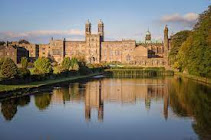 of septicemia during the Second World War when Michael was seven years old in 1940. During the War, his mother married Dick Hollins, a stockbroker and at the end of the War Michael travelled with her to Britain. As he later said : "In 1945 at the end of the war in Europe I returned to England to complete my education". Because of his mother's strict adherence to Catholicism, that completion took place at the fee-paying, Jesuit boarding school for boys, Stonyhurst College in rural Lancashire. By the time that Michael joined the school at the age of twelve the number of priests on the teaching staff had fallen, but the school still had Jesuit philosophy at its core and his seven years there must have had a dramatic and formative effect on him. A year after leaving school, when he was eighteen in 1951, he undertook his two years national service in the Armed Forces and two years after being demobbed, gained a place at St Martin’s School of Art, in London, in 1954. As he said, he went there and : "Studied Commercial Design and Illustration, subjects that at the time seemed more likely than fine art to provide me with a viable future".
He said : "The cluster of musical instruments was created as a logo for a concert hall. One of the two trademark designs was for the whale fishing industry, the other for Merrit, a manufacturer of crab paste. The company diary covers were attempts to enliven dull, workaday items. For the W. S. Collett 1954 Diary, I combined lettering with areas of texture and decorative mark making. For the Samuel Golshman 1955 Diary, I created a stylised clock to symbolise the passage of time".
He went on : "To serve as a trademark for D.H. Hall & Co, a fictional brewer, I borrowed a wild boar from mediaeval heraldry. My design for the beer bottle label surrounded the beast with a varied assortment of typefaces. To ensure that the road sign I designed for the Two Hawks Hotel would stand out, I made it an unusual shape. The hawk itself was based on the ancient Egyptian ‘Hawk of Horus’ in the British Museum.
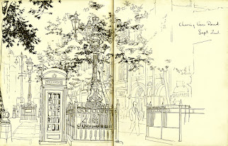
"My 'revent Smog' booklet aimed to promote a clean air campaign. Early 1950’s London sometimes suffered dense smogs known as ‘pea soupers’. My artwork contrasted the lethal gloom of this pollution with a vision of sparkling clean air. All the shop fronts and street details came from my sketch books".
Michael said he was always grateful for his training in commercial design because constructing letters by hand taught him precision and spatial awareness and learning to think in design terms added authority to his illustrations and underpinned his later work as a painter.
 B
B.jpg) y the time he left the Art School, at the age of twenty-four in 1957, he was already working as a freelance illustrator and for most of the 1960s he commuted into the City of London to work as an illustrator in a small studio attached to the offices of his agents, Artist Partners in Ham Yard, Soho.
y the time he left the Art School, at the age of twenty-four in 1957, he was already working as a freelance illustrator and for most of the 1960s he commuted into the City of London to work as an illustrator in a small studio attached to the offices of his agents, Artist Partners in Ham Yard, Soho.
Here, he was busy.jpg) producing artwork for books, magazines, advertising and the press. Much of the work on offer was stimulating and enjoyable but after a time he felt the need to express a more personal vision. His lunch hour visits to the National Gallery fed a growing ambition to make pictures for the wall rather than the page and work that would be experienced in the original rather than in reproduction.
producing artwork for books, magazines, advertising and the press. Much of the work on offer was stimulating and enjoyable but after a time he felt the need to express a more personal vision. His lunch hour visits to the National Gallery fed a growing ambition to make pictures for the wall rather than the page and work that would be experienced in the original rather than in reproduction.
Michael said : "I have often found inspiration in the past in the work of the great Masters of European Painting, many of whose pictures are in London’s National Gallery. As a frequent visitor to the gallery in the sixties and seventies I was particularly drawn to the paintings of Piero de la Francesca, Nicholas Poussin, Jan Vermeer, Edgar Degas and Georges Seurat. Notwithstanding marked differences of both period and style, all these artists created works of great formal authority and I returned to their pictures time and again hoping to learn something from them".
In 1969 Michael painted Roger Coleman, a fellow illustrator at 'Artist Partners' who had graduated from the Royal College of Art, mounted exhibitions at the Institute of Contemporary Art and taught for a spell before coming to illustration. Michael said : "This background made him the ideal companion for our occasional sorties to the National Gallery".
He recalled : "One day, as we were standing in front of Nicholas Poussin’s painting ‘The Adoration of the Golden Calf’, Roger asked me for my thoughts. After looking at the picture for a while, something struck me as compelling. Although filled with dancing and gesticulating figures, the picture somehow managed to maintain a satisfying balance. It also seemed to possess an innate authority that took it way beyond illustration and I began to see Poussin’s picture with new eyes, not just as an image, but as an orderly sequence of forms and spaces. It dawned on me that this sense of underlying order was lacking in my own pictures and was the element of picture making I had been searching for since the start of the decade".
The painter
Michael said : "Meanwhile, at home I experimented, trying my hand at picture making, hoping that what I was doing might one day lead to a show in a reputable London gallery. Although I loved illustration I was aware even then that a good painting had to be more than just a big illustration". His 1959 his 'Three Disciples', 'Magdalen' and 'Lazurus', were all executed in a naturalistic vein in pen Indian Ink, wash & gouache.
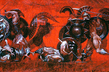
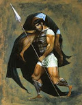
At the same time his 'The Fallen Warrior' and 'Ajax with the Body of Achilles' were stylised in ways that grew out of his enthusiasm for the vase paintings of ancient Greece.
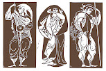
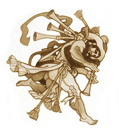
 Yet, while his stylised figures could often be intense and powerful, he felt they could never be the stuff of serious picture making. However, he said they came into their own in his set of linocuts of 'Jason, Medea and Hercules' and the plate design 'Centaur and Satyr' and his design for a mural, 'Peasant Bagpiper'.
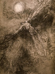
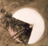 In 1966, at the age of thirty-three and still searching for a suitable mode of expression, he embarked on a number of heavily textured paintings featuring 'Icarus' and the 'Minotaur' - two characters from Greek myth he was obsessed with at the time and the result was 'Icarus Burning Up', 'Icarus across the Sun' and 'The Minotaur in the Maze'.
In the 1960s and 70s, Michael found a valuable source of income in illustrations for magazines and was prolific both in his book illustrations (link) and book jackets (link). In addition, his work for prestigious magazines like 'Sunday Times Magazine' in Britain, 'Time' in the USA and 'Stern' in Germany also provided him with income. (link)

 In 1967 the 'Sunday Times Magazine' commissioned Michael to produce a cover portrait of Jackie Kennedy which related to an article by Dr Alex Comfort about the science of ageing. He said : "My job was to add visual appeal to the text by predicting how a number of public figures might look in about 30 years time. The Jackie Kennedy cover portrait appears here as the magazine printed it, the others were taken from my watercolour originals".
For his work he received the Winsor & Newton Silver Award for 'The Best Editorial Art of ‘68' and in due course he was asked to age more celebrities for the German newsweekly 'Stern', which included some of his Sunday Times portraits and several more including Queen Soraya, the second wife of the last Shah of Persia and Britain's 'The Beatles'.
 Michael recalled : " For a cover of the magazine in May 1968, I created an imaginary portrait of King. As Roman Legate in Britain in about 80 AD, Cogidubnus lived in a magnificent palace at Fishbourne in Sussex. While supervising excavations on the site, the archaeologist Barry Cunliffe uncovered what turned out to be the largest Roman building in Britain and in the process, revealed much of the life that was lived there. My illustration depicts a visiting merchant approaching the palace accompanied by two servants carrying a trunk full of samples to show the king".
As an illustrator with ambitions to be a painter, Michael found the contemporary art scene of 1960’s London both difficult to connect with and confusing. He said what he was looking for was something to fire his imagination and perhaps give him direction and to his surprise, he found it in the work of an abstract painter, Robyn Denny. He discovered that a set of his screen prints made, what he called : "A magical use of close-toned colour in a format of standing rectangles" and he wondered if such effects could work for figurative pictures like his own. .jpg)
.jpg) Michael said that : "To some degree, my subsequent paintings were an attempt to find out. I put close-toned effects to radical use in an early self portrait, In a 'Dark Window' in 1970". He used similar effects in 'Leroy in a Blanket' in the sane year and 'Under a Tree' in 1972.
Michael said that : "To some degree, my subsequent paintings were an attempt to find out. I put close-toned effects to radical use in an early self portrait, In a 'Dark Window' in 1970". He used similar effects in 'Leroy in a Blanket' in the sane year and 'Under a Tree' in 1972.
He said : "As well as adding a note of ambiguity, this tonal restraint served as an antidote to the high impact, high key sensationalism of the commercial world I was aiming, eventually, to leave behind".

 In 1967 the 'Sunday Times Magazine' commissioned Michael to produce a cover portrait of Jackie Kennedy which related to an article by Dr Alex Comfort about the science of ageing. He said : "My job was to add visual appeal to the text by predicting how a number of public figures might look in about 30 years time. The Jackie Kennedy cover portrait appears here as the magazine printed it, the others were taken from my watercolour originals".
  Michael recalled : " For a cover of the magazine in May 1968, I created an imaginary portrait of King. As Roman Legate in Britain in about 80 AD, Cogidubnus lived in a magnificent palace at Fishbourne in Sussex. While supervising excavations on the site, the archaeologist Barry Cunliffe uncovered what turned out to be the largest Roman building in Britain and in the process, revealed much of the life that was lived there. My illustration depicts a visiting merchant approaching the palace accompanied by two servants carrying a trunk full of samples to show the king".
.jpg)
.jpg) Michael said that : "To some degree, my subsequent paintings were an attempt to find out. I put close-toned effects to radical use in an early self portrait, In a 'Dark Window' in 1970". He used similar effects in 'Leroy in a Blanket' in the sane year and 'Under a Tree' in 1972.
Michael said that : "To some degree, my subsequent paintings were an attempt to find out. I put close-toned effects to radical use in an early self portrait, In a 'Dark Window' in 1970". He used similar effects in 'Leroy in a Blanket' in the sane year and 'Under a Tree' in 1972.  Michael had been attracted to painters in the Realist mainstream of American art and was encouraged to learn that, like him, both Winslow Homer and Edward Hopper had spent much of their early careers working as Illustrators. He was also drawn to some of their successors, in particular Richard Estes, who used photographic stills to create paintings that appeared to be photographs and whose cityscape reflections in plate glass windows inspired him to embark on a series of ‘window’ pictures of his own.
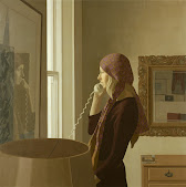
 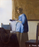 Michael was almost forty when some of this work came to the attention of Fischer Fine Art, a distinguished London gallery of the day and in 1972 several of his paintings were included in one of their group shows. At this stage his work tended to be formal, sober and low key, like his 1971 'Brigid on the Telephone' which he said paraphrased Vermeer's ‘Woman in Blue Reading a Letter’ and was a clear distance between himself from the sensational values of the commercial world he was leaving behind.
.jpg)
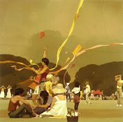 In 1974 the Gallery gave him first 'One Man Show' and after that he gradually left illustration behind and by degrees his work became more animated and colourful. In his 1977, 'Afternoon of the Kites', a crowd of people are seen flying kites under a thundery sky which, Michael said, "Shares thematic and formal ties with Seurat’s ‘La Grande Jatte’"
In 1978-79, across the street from his studio, Michael said : "Men worked with unconscious grace against a grid of scaffolding and sky and this led me to paint several highly structured pictures such as 'Scaffolders', 'Passage of Arms' and 'Up on the Roof'".
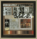
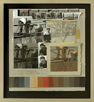 After the completion of one of these more complicated compositions he sometimes made a collage that told the story of its making. Typically, this featured selected frames from his contact strips together with some of the working prints derived from them. A tracing showed elements of the composition in outline while a colour study indicated tone and colour and his colour mixes for use in the painting’s later stages appeared like a ‘medal ribbon’ at the base of the collage.
He said to give it some presence as an object, he presented the collage in a shallow box and treated some of his less complex compositions like 'The Illustrated Man' 1979 and 'Stooping Bather' in 1980 in the same way.
Michael's friend Viv Lawrence has said that : "Like many gay men of his generation Michael delighted in the changes in law and in attitudes towards same-sex relationships. His tender and affectionate drawings were used in Edmund White’s groundbreaking book The Joy of Gay Sex in 1977". Michael himself said : "Mitchell Beazley enlisted my help with their next project, a gay counterpart to Alex Comfort’s 'The Joy of Sex'. The world was a very different place in the mid seventies - the gay revolution was still in its early days and the spectre of AIDS had yet to fully reveal itself. To a diffident gay man like myself, it seemed the perfect moment for such a book".
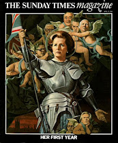
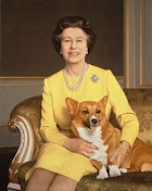
 In 1975 he was commissioned by the Sunday Times Magazine to paint the Ugandan dictator Idi Amin. Michael said : " In December 1975, my cover portrait depicted Idi Amin Dada, the Ugandan dictator, resplendent in garter robes with a chest full of dodgy medals. A satirical feature in the magazine linked topical news stories of the day with well known paintings, in Idi Amin’s case, Pietro Annigoni’s 1950’s portrait of H. M. The Queen".
.jpg)

When he was a students at St Martin’s School of Art and for a short time afterwards, as a professional illustrator, Michael worked from either life or his imagination and, with deadlines to meet, found that the camera provided him with the basic information he needed. When he transferred to the life as a painter his own photographers were a primary reference. Then, more often that not, he did further drawings and colour studies before embarking on the painting itself.
He said he processed a film for the first time when he was 34 years old in 1967 : "Passing it nervously from hand to hand through some developing fluid in a darkened room". Many of his early films were severely overdeveloped, but he soon discovered that dense black negatives subjected to long exposure, could result in prints, which he said were : "As seductively grainy as Seurat drawings".
He said his photographs of Desmond Heeley, the theatre designer, draped in a linen table cloth, made him look like a biblical prophet in a sandstorm, which was, in fact, the plain white wall of his studio. The first five pictures were lit by a single 100 watt bulb and all the others, apart from a few shots taken out of doors, were lit by a patch of bright cloud at the window.
.jpg)
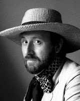 It was through Desmond that he got to know two of his fellow designers, Tanya Moiseiwitch and Anthony Powell whose costume designs had won him three Oscars. He recalled : "One day when all of us were together at Anthony’s house he raided his unique collection of authentic period clothes to transform Tanya, first into an Edwardian ‘Grande Dame’, then a sophisticated woman of the thirties and finally, a stylish, forties heiress. Fortunately I had my camera with me".
He said : "After helping me put this look together David Walker, another designer friend, had used the same ruff to nudge me into the sixteenth century as well. These enjoyable sessions gave me a real feel for period. This proved particularly useful some years later, when I embarked on my ‘Portraits in Time’- a set of drawings that pitched a number of my contemporaries back through time to an earlier age".
 He said he often encouraged his subjects to act a part rather than expecting them to just be themselves in front of the camera and paradoxically, this helped them to relax. This helped William Pierce become Pan with vine leaves in his hair and horns made out of taped-up pipe cleaners and Geoffrey Rogers assume the character of an inmate of Bedlam.

Ian Judge, also wrapped in a blanket, evoked the face of death in Ingmar Bergman’s film 'The Seventh Seal'.
In addition. he invariably I took his camera with him when visiting ‘out of town’ friends. He called in on Roy Strong and Julia Trevelyan-Oman at their Regency cottage in Brighton, shortly after their surprise elopement in September 1971 and was among the first to reveal them as blissfully happy newlyweds. Two years later Roy would become, at the age of 38, the youngest Director of the Victoria and Albert Museum.
 "Over time, my photographs became somewhat less coarse grained and took on a more documentary tone. Astrid Zydower, the sculptor and Yolanda Sonnabend, the theatre designer, sat for me in the context of their studios".
 Michael said that Paul Harbutt, the painter with his family around him, posed within the confines of a large picture frame and Jim Farrell, the Booker Prize winning novelist, was wary of the camera lens, but seemed remarkably at ease in front of Michael. He said that he sadly met his death in an accident only a month or two after their photo session and Lavinia Graecen, his biographer, featured several one of his pictures on the cover of her book, ‘J.G.Farrell: The Making of a Writer’.
"While my paintings are largely celebratory, I try to charge them with enough intensity and inner life to persist in the memory"


.png)
.png)

.jpg)


.jpg)




.jpg)
.jpg)




.jpg)
.jpg)

.jpg)
.jpg)

.jpg)


.jpg)


.jpg)
.jpg)
.jpg)



This is perfect. Thank you.
ReplyDelete